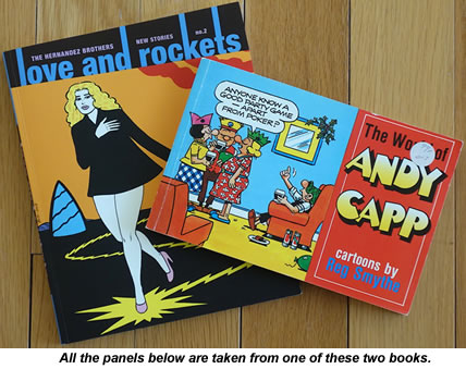
 Back in 2012, when I was researching PlanetSlade's Andy Capp piece, I kept on noticing how much Reg Smythe's art made me think of Jamie Hernandez's work in the modern comic book Love & Rockets.
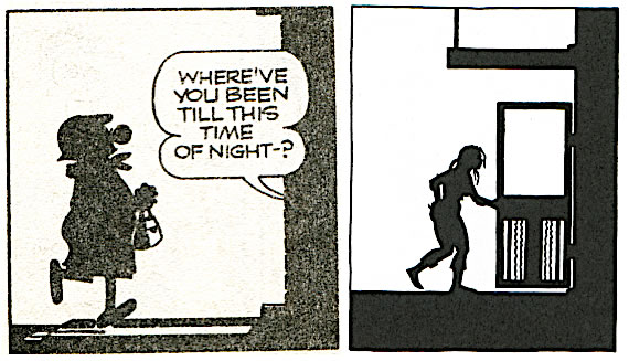
Both men have a very economical clear-line drawing style, with no intermediate grey tones, and share a flawless sense of where to place each panel's areas of solid black ink.
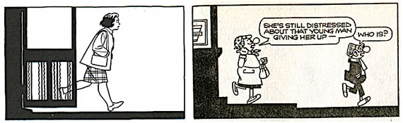
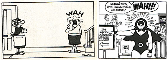
Both also have the knack of depicting a convincing background with the bare minimum of lines, and both are happy to use abstract cartooning icons in their work, such as Smythe's dustball symbol to represent the idea of Flo and Andy fighting. They both use a lot of silhouettes in their work too.
I've never seen Hernandez acknowledge any debt to Andy Capp in his interviews but, by whatever route the influence came, it's clear the two men ended up using a very similar toolbox of quite specific cartooning techniques.
The panel-by-panel comparisons below will demonstrate what I'm taking about. These are all the more striking for the fact that I had to search just two random collections to find them all: World of Andy Capp 1989 and Love & Rockets New Stories #2 from 20 years later. I sent Hernandez a copy of these comparisons and asked him if he'd been aware of the Andy Capp strip at all while teaching himself to draw in California. If so, did he detect the same kinship between his work and Smythe's that I was seeing?
"Of course I know Andy Capp," he replied. "We had it in our small local paper when I was growing up. While I never thought I was influenced by the strip, I can now see the similarities so maybe it was an unconscious influence. Thanks for pointing it out."
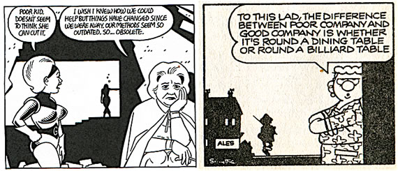
1) Silhouetted buildings
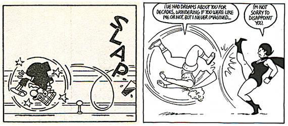
2) Cartoon iconography (in this case crying)
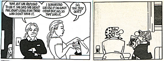
3) Foreground/background split
4) Minimalist backgrounds
5) Slapstick cartoon violence
6) Silhouetted people